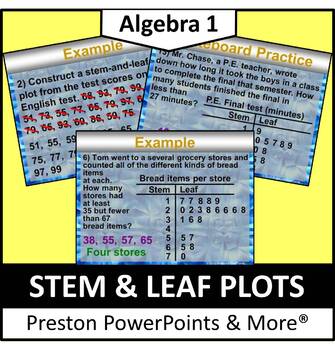
Stem and Leaf Plots in a PowerPoint Presentation
- Zip
Description
Stem and Leaf Plots in a PowerPoint Presentation
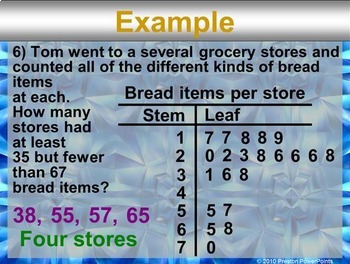
This slideshow lesson is very animated with a flow-through technique. I developed it for my Algebra 1 class, but it can be used for lower grades as well. This lesson was one of a chapter that was used as a review for all previous grades. The lesson teaches how to interpret data from the stem-and-leaf plot and make and use a stem-and-leaf plot to put data in order.
NEW: The lesson is in an editable format so you can tailor the lesson to your class. The problems and clipart can’t be edited due to the TOU and to maintain the copyright integrity of the product. You can change the problem number and the names. Using student’s or teacher’s names can be another hook. If you need an alternative version because your country uses different measurements, units, or slight wording adjustment for language differences just email me at PrestonPowerPoints@gmail.com. I am respond to email quickly.
The presentation has 31 slides with lots of whiteboard practice. Use as many or as few of the problems to help your students learn each concept. For more PowerPoint lessons & materials visit:
http://www.teacherspayteachers.com/Store/Preston-Powerpoints
Students often get lost in multi-step math problems. This PowerPoint lesson is unique because it uses a flow-through technique, guided animation, that helps to eliminate confusion and guides the student through the problem. The lesson highlights each step of the problem as the teacher is discussing it, and then animates it to the next step within the lesson. Every step of every problem is shown, even the minor or seemingly insignificant steps. A helpful color-coding technique engages the students and guides them through the problem (Green is for the answer, red for wrong or canceled numbers, & blue, purple & sometimes orange for focusing the next step or separating things.) Twice as many examples are provided, compared to a standard textbook. All lessons have a real-world example to aid the students in visualizing a practical application of the concept.
This lesson applies to the Common Core Standard:
Statistics and Probability 8.SP.4
Investigate patterns of association in bivariate data.
4. Understand that patterns of association can also be seen in ivariate categorical data by displaying frequencies and relative frequencies in a two-way table. Construct and interpret a two-way table summarizing data on two categorical variables collected from the same subjects. Use relative frequencies calculated for rows or columns to describe possible association between the two variables.
This resource is for one teacher only. You may not upload this resource to the internet in any form. Additional teachers must purchase their own license. If you are a coach, principal or district interested in purchasing several licenses, please contact me for a district-wide quote at prestonpowerpoints@gmail.com. This product may not be uploaded to the internet in any form, including classroom/personal websites or network drives.
*This lesson contains 14 problems. Each problem in this lesson uses several pages in order to achieve the animated flow-through technique.


