TPT
Total:
$0.00

Statistics - Unit 7 - BUNDLE for Google Slides™

Rated 4.8 out of 5, based on 31 reviews
4.8 (31 ratings)
;
Math At The Core
393 Followers
Grade Levels
7th - 8th, Homeschool
Resource Type
Standards
Formats Included
  • Zip
  • Google Apps™
  • Internet Activities
$5.00
List Price:
$8.00
You Save:
$3.00
Bundle
$5.00
List Price:
$8.00
You Save:
$3.00
Bundle
Share this resource
Report this resource to TPT
Math At The Core
393 Followers
Includes Google Apps™
This bundle contains one or more resources with Google apps (e.g. docs, slides, etc.).

Products in this Bundle (4)

    Description

    - Great for online and distance learning! Created to be compatible with Google Slides™!

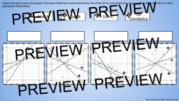
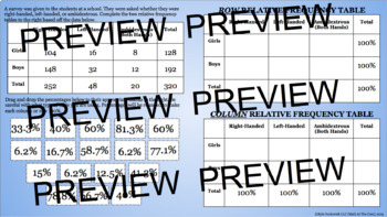
    -In this interactive unit, students will interpret scatter plots. They should be able to determine what type of correlation a situation has whether it is by graph or through words. They should be able to identify clusters and outliers. students will analyze scatter plots and determine the line of best fit. They will use the line of best fit and the equation of that line to predict values. They should also be able to explain the correlation between the two given variables. Students will construct and interpret two-way relative frequency tables. Students should be able to determine the percent of given values.

    - Includes all 4 activities shown above with over 150 problems!

    Available in the full curriculum bundle!

    Pre-Algebra - Curriculum - BUNDLE for Google Slides™

    - PLEASE NOTE - this download contains PDF answer keys. On the second slide, the first step of the directions includes the link to the student version of the activity. All students and teachers using this activity must have a free Google account to use this activity on the Google Slides interface. Students can complete the activity and share it back with their teacher.

    **DOWNLOAD INCLUDES - Every pdf file teacher guide explaining each activity with a link to click to copy the Google activity to your drive. It also includes the answer key (not available in the Google Slide).

    Total Pages
    Answer Key
    Included
    Teaching Duration
    3 days
    Report this resource to TPT
    Reported resources will be reviewed by our team. Report this resource to let us know if this resource violates TPT’s content guidelines.

    Standards

    to see state-specific standards (only available in the US).
    Construct and interpret scatter plots for bivariate measurement data to investigate patterns of association between two quantities. Describe patterns such as clustering, outliers, positive or negative association, linear association, and nonlinear association.
    Know that straight lines are widely used to model relationships between two quantitative variables. For scatter plots that suggest a linear association, informally fit a straight line, and informally assess the model fit by judging the closeness of the data points to the line.
    Use the equation of a linear model to solve problems in the context of bivariate measurement data, interpreting the slope and intercept. For example, in a linear model for a biology experiment, interpret a slope of 1.5 cm/hr as meaning that an additional hour of sunlight each day is associated with an additional 1.5 cm in mature plant height.
    Understand that patterns of association can also be seen in bivariate categorical data by displaying frequencies and relative frequencies in a two-way table. Construct and interpret a two-way table summarizing data on two categorical variables collected from the same subjects. Use relative frequencies calculated for rows or columns to describe possible association between the two variables. For example, collect data from students in your class on whether or not they have a curfew on school nights and whether or not they have assigned chores at home. Is there evidence that those who have a curfew also tend to have chores?

    Reviews

    Questions & Answers

    393 Followers