TPT
Total:
$0.00

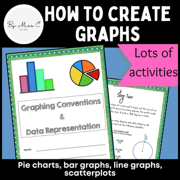
Guide to graphs: Pie charts, bar graphs, line graphs, scatterplots + activities

Rated 5 out of 5, based on 3 reviews
5.0 (3 ratings)
;
By Miss C
94 Followers
Grade Levels
6th - 12th, Higher Education, Adult Education, Homeschool
Standards
Formats Included
  • Zip
Pages
41 pages
$3.99
$3.99
Share this resource
Report this resource to TPT
By Miss C
94 Followers

What educators are saying

This resource was used in my Technical Writing Class. The students were very engaged in this resource and it was perfect to add to my Graphic and Visual Aids Unit. Thank you so much.

Description

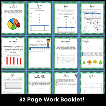
This is a fantastic resource for introducing students to graphing and data representation. This booklet will take students through the uses for particular graphs and how to construct them. At the end of each module, there are activities for students to complete, to practice their graphing skills. Answer key is included, making this a no-prep activity.

This booklet covers:

- why we visually represent data

- pie charts and how to create them

- bar graphs and how to create them

- line graphs and how to create them

- scatter plots and how to create them

- correlation - recognising trends

- line of best fit

- example scenarios and step-by-step instructions

- graphing activities

Students can hold onto this booklet for future reference, throughout their school life. Suitable for maths, science and geography studies.

Thank you for downloading! Your feedback is greatly appreciated!

Total Pages
41 pages
Answer Key
Included
Teaching Duration
N/A
Report this resource to TPT
Reported resources will be reviewed by our team. Report this resource to let us know if this resource violates TPT’s content guidelines.

Standards

to see state-specific standards (only available in the US).
Construct and interpret scatter plots for bivariate measurement data to investigate patterns of association between two quantities. Describe patterns such as clustering, outliers, positive or negative association, linear association, and nonlinear association.
Know that straight lines are widely used to model relationships between two quantitative variables. For scatter plots that suggest a linear association, informally fit a straight line, and informally assess the model fit by judging the closeness of the data points to the line.
Graph proportional relationships, interpreting the unit rate as the slope of the graph. Compare two different proportional relationships represented in different ways. For example, compare a distance-time graph to a distance-time equation to determine which of two moving objects has greater speed.
Informally assess the fit of a function by plotting and analyzing residuals.
Fit a linear function for a scatter plot that suggests a linear association.

Reviews

Questions & Answers

94 Followers