TPT
Total:
$0.00

Graphing, Statistics & Data Analysis in Middle Grades Using TI-Nspire

Rated 5 out of 5, based on 2 reviews
5.0 (2 ratings)
;
TraylorMath
43 Followers
Grade Levels
5th - 9th, Staff
Standards
Formats Included
  • PDF
Pages
31 pages
$12.95
$12.95
Share this resource
Report this resource to TPT
TraylorMath
43 Followers

Description

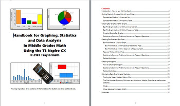
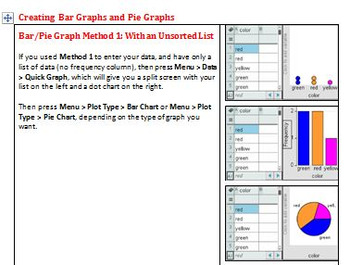
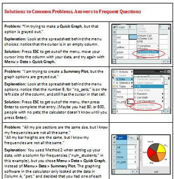
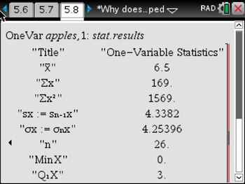
This 30-page handbook ties together everything you need to use TI-Spire technology to teach middle school level data graphing and statistics. It will show you, step-by-step, how to create bar graphs, pie graphs, dot plot, box plots and histograms, and several methods for finding mean and quartiles, as well as an easy way to calculate Mean Absolute Deviation (MAD) with TI-Nspire. It also answers all those student questions about "why doesn't my graph look right?" Developed though several years of experience with 7th and 8th graders using Nspire CXs to create graphs and analyze data, I hope I've addressed all the possible pitfalls. You can copy all or parts of this handbook for student use.

Please see the Table of Contents for a complete list of topics!

Note: this handbook does not cover scatter plots, regression or two-way tables.

Total Pages
31 pages
Answer Key
N/A
Teaching Duration
N/A
Report this resource to TPT
Reported resources will be reviewed by our team. Report this resource to let us know if this resource violates TPT’s content guidelines.

Standards

to see state-specific standards (only available in the US).
Display numerical data in plots on a number line, including dot plots, histograms, and box plots.
Giving quantitative measures of center (median and/or mean) and variability (interquartile range and/or mean absolute deviation), as well as describing any overall pattern and any striking deviations from the overall pattern with reference to the context in which the data were gathered.
Relating the choice of measures of center and variability to the shape of the data distribution and the context in which the data were gathered.
Informally assess the degree of visual overlap of two numerical data distributions with similar variabilities, measuring the difference between the centers by expressing it as a multiple of a measure of variability. For example, the mean height of players on the basketball team is 10 cm greater than the mean height of players on the soccer team, about twice the variability (mean absolute deviation) on either team; on a dot plot, the separation between the two distributions of heights is noticeable.
Use measures of center and measures of variability for numerical data from random samples to draw informal comparative inferences about two populations. For example, decide whether the words in a chapter of a seventh-grade science book are generally longer than the words in a chapter of a fourth-grade science book.

Reviews

Questions & Answers

43 Followers