
Different Types of Graph - High quality HD Animated Video - eLearning
- Streaming Video(cannot be downloaded)
- Supporting Information
Also included in
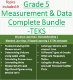 This bundle "Measurement and Data" contains below 9 topics aligned to the TEKS curriculum. It helps the users to understand the concepts of the chapter "Measurement and Data". C3D-Learning also supports the CC, NGSS, VA, and FL curriculum with sub-strands aligned and is visually engaging with high-qPrice $9.00Original Price $13.56Save $4.56
Description
It’s well known among educators that complex and abstract topics can be understood more easily (especially by younger students) when concepts are introduced visually. Visuals not only improve a student’s ability to understand how something works, but
also help with retention. Furthermore, by seeing the “whole” of something, children are better able to understand the parts.
Even more importantly, research shows that 3D-animated models are able to represent information in the most efficient manner to speed learning and comprehension.85% of students prefer visual and kinesthetic learning while only 15% prefer hearing about a topic as a way to learn about it.
Research findings:
- Faster absorption of material
- Deeper understanding of subjects
- Increased attention span
- Better retention of material
- Greater motivation to learn
- More engagement with content
- Higher test scores
This resource will help a teacher to explain the topic visually in detail. Where as the students can learn and feel the excitement in learning with high-end visuals.These topics are curriculum aligned and written by USA teachers.
Please see the preview for the quality, and Supporting document preview for the complete audio for the video to know more about whats been covered in the video.
Video Script:
Title of Lesson:
Different Types of Graphs
Attention Getting Question:
How do you get all of the information you collect into a picture that’s easy to read?
Introduction:
Graphs represent data or information gathered about people or things. Let’s learn about scatter plots, line graphs, line plots, stem-and-leaf plots, bar graphs, and frequency tables.
Subject:
A scatter plot is used to find the relationship between two sets of data. For example, if you want to find the relationship between student test scores and the number of hours each student studied, you would use a scatter plot. The horizontal axis shows the number of hours studied, while the vertical axis shows the test scores. For one hour studied, the grade was 75; for two hours, the grade was 80; for three hours, the grade was 95; and for four hours, the grade was 95. As you can see, this scatter plot does not show a direct line, but it does show a trend. That means there is a relationship between the two sets of data.
A line graph is a type of graph that shows how the number of something changes over time. This graph shows how the temperature changes over the course of a week. Monday’s temperature is 80 degrees, Tuesday’s temperature is 75 degrees, Wednesday’s is 80 degrees, Thursday’s is 85 degrees, and Friday’s is 90 degrees. After the points are plotted, a line is drawn connecting them, showing how the temperature has changed.
A line plot shows the frequency of data. Every occurrence of a number is plotted on the chart in its proper place. For example, we can use a line plot if we want to see the number of pets each student has.
Your line plot has the number lineon the horizontal axis. Each time you see the number in your data, you plot it with an x in the vertical axis above the corresponding number in the number line. What if you don’t have a number value for a number on the line? If you don’t have it, then you leave the area in the chart blank. So, if your class has 6 nine year olds, 10 ten year olds, and 5 eleven year olds, then our line plot would look like this.
A stem-and-leaf plot is used to organize numbers in a table by their leading values. Let’s look at these numbers. On the left side of the line are the stems. Stems are the leading values of a number. On the right side are the leaves. Leaves are the remaining values in the number. The data is arranged by place value and it provides details of individual values.
In bar graphs, data is shown in rectangular bars that represent the number of units. The horizontal axis shows categories while the vertical axis shows the number of units. So, a bar graph is useful if you want to display your class’s favorite snack, favorite book, or favorite movie.
A frequency table is used to display the amount of times a number occurs. On the left side, it shows numbers in order. The right side shows how many times the number occurs. In this table, 5 people have zero siblings and one person has 4.
Summary:
Essentially, graphs display data and can make a lot of information easy to understand. A scatter plot shows the relationship between two sets of data. A line graph shows the change of a value over time. A line plot shows the frequency of data on a number line. A stem-and-leaf plot organizes numbers by their leading values, and a bar graph displays the number of units in the form of rectangular bars. A frequency table displays the amount of times a number occurs in a table. Create your own graph, chart, or table to display information you’ve collected!
