
Bivariate Data Anchor Charts


- PDF
What educators are saying
Also included in
 This bundle contains all the anchor charts I use to help my students master mathematical content.The anchor chart topics includeThe Number SystemFractionsGreatest Common FactorLeast Common MultipleEquations and ExpressionsExponents RulesScientific Notation (including operations and scientific notatiPrice $20.00Original Price $28.00Save $8.00
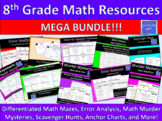 This bundle contains my most engaging resources and activities that I use to help my students master the 8th grade common core standards. Individually, this bundle would cost $207. SAVE $102 dollars by buying this bundle! Don't need all of these resources? Want to make a custom bundle of just youPrice $105.00Original Price $210.00Save $105.00
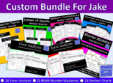 This bundle was custom made for Jake. It contains the following:20 Error Analysis resources includingOrder of OperationsSimplifying Algebraic ExpressionsSolving Multi-Step EquationsSolving Multi-Step InequalitiesSolving Proportions Using the Cross ProductCalculating SlopeGraphing Linear Equations bPrice $72.00Original Price $144.00Save $72.00
Description
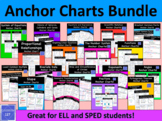
This resource contains two different anchor charts to help students learn about bivariate data.
To be more specific, the anchor charts help students to master the concepts of
- scatterplots
- two way tables
This product also includes directions on how you can enlarge these anchor charts for free! Having the ability to see these charts from anywhere in the room has, in particular, really helped my ELL and SPED students master these challenging concepts.
Possible uses for this product include
- enlarge and use as classroom decor
- include as a part of an interactive notebook
- print on the back of homework assignments
- send to absent students to help them catch up on missed classroom instruction
These anchor charts come in color as well as in black and white.
For more resources involving bivariate data, please consider downloading
Two Way Frequency Table Guided Notes and Homework
If you like this anchor chart, you may also like
The Number System Anchor Charts
Greatest Common Factor Anchor Charts **FREE**
Least Common Multiple Anchor Charts **FREE**
Equations and Expressions Anchor Charts
Scientific Notation Anchor Charts
The Pythagorean Theorem Anchor Charts
Area and Circumference of a Circle Anchor Charts **FREE**
Proportional Relationships Anchor Charts **FREE**
Graphing Linear Equations Anchor Charts
Real World Slope Intercept Form Anchor Charts **FREE**
Solving System of Equations Anchor Charts
Geometric Transformations Anchor Charts
The Volume of Cylinders, Cones, and Spheres Anchor Charts **FREE**
**Finally, don't forget to rate and comment to earn TPT credits!**
