TPT
Total:
$0.00

Scatter Plots and Lines of Best Fit - PROJECT BASED LEARNING

;
Math with Mannix
4 Followers
Grade Levels
8th
Resource Type
Standards
Formats Included
  • Google Driveā„¢ folder
Pages
6 pages
$5.95
$5.95
Share this resource
Report this resource to TPT
Math with Mannix
4 Followers
Made for Google Driveā„¢
This resource can be used by students on Google Drive or Google Classroom. To access this resource, youā€™ll need to allow TPT to add it to your Google Drive. See ourĀ FAQĀ andĀ Privacy PolicyĀ for more information.

Description

MATH with MANNIX


Project Based Learning

SWBAT research their own topic to see if there is a correlation.

SWBAT gather their own data and create scatter plots and lines of best fit

SWBAT interpret and describe their findings

SWBAT analyze classmates findings


GoogleDrive- Includes GoogleSlides and GoogleDocs

Can be used for individuals or groups!


What is included...

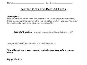
Outline of project

Rubric

Data Sheets

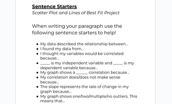
Sentence Starters/Why we write in math doc

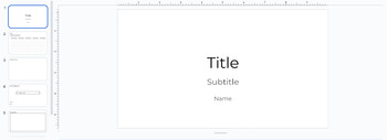
GoogleSlide Template

Classmate Reflection sheet


Construct and interpret scatter plots for bivariate measurement data to investigate patterns of association between two quantities. Describe patterns such as clustering, outliers, positive or negative association, linear association, and nonlinear association. 2. Know that straight lines are widely used to model relationships between two quantitative variables. For scatter plots that suggest a linear association, informally fit a straight line, and informally assess the model fit by judging the closeness of the data points to the line. 3. Use the equation of a linear model to solve problems in the context of bivariate measurement data, interpreting the slope and intercept. For example, in a linear model for a biology experiment, interpret a slope of 1.5 cm/hr as meaning that an additional hour of sunlight each day is associated with an additional 1.5 cm in mature plant height. 4. Understand that patterns of association can also be seen in bivariate categorical data by displaying frequencies and relative frequencies in a two-way table. Construct and interpret a two-way table summarizing data on two categorical variables collected from the same subjects. Use relative frequencies calculated for rows or columns to describe possible association between the two variables. For example, collect data from students in your class on whether or not they have a curfew on school nights and whether or not they have assigned chores at home. Is there evidence that those who have a curfew also tend to have chores?

Total Pages
6 pages
Answer Key
N/A
Teaching Duration
1 Week
Report this resource to TPT
Reported resources will be reviewed by our team. Report this resource to let us know if this resource violates TPTā€™s content guidelines.

Standards

to see state-specific standards (only available in the US).
Construct and interpret scatter plots for bivariate measurement data to investigate patterns of association between two quantities. Describe patterns such as clustering, outliers, positive or negative association, linear association, and nonlinear association.
Know that straight lines are widely used to model relationships between two quantitative variables. For scatter plots that suggest a linear association, informally fit a straight line, and informally assess the model fit by judging the closeness of the data points to the line.
Use the equation of a linear model to solve problems in the context of bivariate measurement data, interpreting the slope and intercept. For example, in a linear model for a biology experiment, interpret a slope of 1.5 cm/hr as meaning that an additional hour of sunlight each day is associated with an additional 1.5 cm in mature plant height.
Understand that patterns of association can also be seen in bivariate categorical data by displaying frequencies and relative frequencies in a two-way table. Construct and interpret a two-way table summarizing data on two categorical variables collected from the same subjects. Use relative frequencies calculated for rows or columns to describe possible association between the two variables. For example, collect data from students in your class on whether or not they have a curfew on school nights and whether or not they have assigned chores at home. Is there evidence that those who have a curfew also tend to have chores?
Reviews

Questions & Answers

4 Followers