TPT
Total:
$0.00

Population Growth interactive Numbers workbook

;
msluss
3 Followers
Grade Levels
6th - 9th
Standards
Formats Included
  • Zip
Pages
7 pages
$4.50
$4.50
Share this resource
Report this resource to TPT
msluss
3 Followers

Description

In this interactive workbook students will learn how to create different kind of charts from data tables around the topic of world population growth.

First they will guess the total number of people living on earth and draw where in the world they are living. Secondly we look at adding columns to a table and adding a simple sum function to calculate the total number of people living on earth over a period of 120 years. This column we will then plot on a line graph.

This lesson also covers:

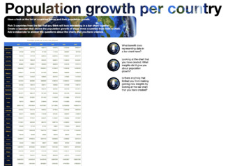
Bar charts and population growth per country

Pyramid charts and population pyramids

Line charts and demographic transition models

Each activity includes reflection questions where students add voicenotes to explain their graphs and what they can deduce from them.

Total Pages
7 pages
Answer Key
N/A
Teaching Duration
3 hours
Report this resource to TPT
Reported resources will be reviewed by our team. Report this resource to let us know if this resource violates TPT’s content guidelines.

Standards

to see state-specific standards (only available in the US).
Understand that a set of data collected to answer a statistical question has a distribution which can be described by its center, spread, and overall shape.
Display numerical data in plots on a number line, including dot plots, histograms, and box plots.
Understand that statistics can be used to gain information about a population by examining a sample of the population; generalizations about a population from a sample are valid only if the sample is representative of that population. Understand that random sampling tends to produce representative samples and support valid inferences.
Use data from a random sample to draw inferences about a population with an unknown characteristic of interest. Generate multiple samples (or simulated samples) of the same size to gauge the variation in estimates or predictions. For example, estimate the mean word length in a book by randomly sampling words from the book; predict the winner of a school election based on randomly sampled survey data. Gauge how far off the estimate or prediction might be.
Informally assess the degree of visual overlap of two numerical data distributions with similar variabilities, measuring the difference between the centers by expressing it as a multiple of a measure of variability. For example, the mean height of players on the basketball team is 10 cm greater than the mean height of players on the soccer team, about twice the variability (mean absolute deviation) on either team; on a dot plot, the separation between the two distributions of heights is noticeable.

Reviews

Questions & Answers

3 Followers